Sunday, November 28, 2010

Design is Dangerous


Ipods are one of the most popular portable media players used today. There are a variety of models and generations, but one thing still stays the same, iPod ear buds. Since the ear buds are included free with the iPod, many people continue to use them not knowing the hidden potential dangers.

iPod ear buds are made cheap and are not meant to last. Many people have to constantly replace their iPod ear buds with new ones because of the fact that they keep breaking. Since the iPod chords are very long, they tend to get tangled up and snagged onto almost anything and everything, this is how many ear buds break. But this is especially dangerous when the ear buds are in the ear and the cord could potential hook onto a moving object, then it can pull the person along by the ears, possibly causing accidents. Also producing cheap ear buds that break easily produces excess waste, which is damaging to the environment. Broken ear buds can harm wildlife. Because of the iPod’s design, the long cords can easily get tangled and caught onto animals.


In the past, the ear buds came with a slip on soft foam cover to fit over the ear bud to make it more comfortable to place inside the ear, but this was an ineffective design. There was nothing securing the foam cover on to the ear bud, so it often fell off and people would loose them, creating more waste into the environment. The foam cover did not do any good for people’s ears either. The foam covers easily collected dust and dirt, and every time people placed it into their ears, they were clogging their ears with dirt, dust and bacteria, impairing their hearing.

In terms of iPod ear bud’s design and noise cancellation, it has none. For this reason, many people like to turn up their iPod the maximum volume to cover up outside noises. This does not only disrupts other surrounding people because they can hear the music from three feet away, it is also damaging to the ears. Listening to loud music periodically causes hearing loss over time. When the main audience of iPods consists children, teens and young adults, as they mature their hearing ability will have been negatively impacted.

Design in Society


Apple has consistently changed the world of design with new personalized products that improve the way we live our lives. This laptop design was made specifically with the idea of human use in mind. When designers created this product they took into consideration our human interactions with the object; how we would view the object and most importantly use the object. Designers aim to create a product that is versatile, dependable and efficient. In many ways the Macbook Pro design meets these factors. Though there is no perfect design, the Macbook Pro design is utopian because it aims to improve society.

Unlike many other laptop designs, the Macbook Pro was made to be reliable and dependable so that people do not have to worry about their laptop crashing when they need it the most. Though it maybe a bit pricey, it is well worth it in the end to save the stress and hassle of repairs. The Macbook Pro is very versatile, whether you are a student or working at the office, or an artist, the consistent design is capable of a variety of things. This is what makes the design so successful. The versatility allows tasks to be done much more quickly and efficiently. This is what makes the design very effective and functional for people. Time is very valuable and efficiency is key in this fast paced society that we live in. What is great about this design is that it opens up so many opportunities for people to learn, network, research, create and so much more. This design is utopian because it is a valuable tool that can be used to aid us in almost anything we do.


Credits: http://bindapple.com/

Color Transforms

If I were to imagine the color red, chances are that the red color that I had imagined would not be the same red as the person next to me. In the book Interaction of Colors, Josef Albers discusses how color is constantly changing and it is almost impossible to see a color alone by itself because it is always seen in relation to the colors it is surrounded by.


The green grid on the left appears to be different than the green on the right, but in actuality both greens are the same. It is the surrounding color that deceives our eyes into seeing them as different shades. It is said that color is understood through experience. When we compare and contrast different colors it helps us to understand their interaction and can learn to apply this to design. 

Interior designers often work with color and must observe how colors interact within a space. When interior designers are designing, they must take into consideration of how the space will be perceived as a whole. Color themes are often used because a certain combination of colors can portray specific feelings and moods that are desired within a space. A combination of green and white colors in the design below give an earthy-feel and peaceful appeal to the room below. 

Saturday, November 13, 2010

“Zero” Messenger Bag

When manufacturing products, many people do not realize how much was thrown away, in order to create that product. For example, in manufacturing clothing, much of the excess leftover fabric is simply thrown in the trash after the final piece of clothing is made. However, one company is breaking that cycle by sending a message of sustainability and creating a product with zero waste.


Rickshaw Bagworks is a company located in San Francisco that produces messenger bags that are designed to eliminate wasted material. The bags are hand crafted and are made from post consumer material from U.S companies. The fabrics used in manufacturing are recycled fabrics made with recycled beverage bottles. What’s unique about this company is that even leftover scraps from production are used in the bag’s design, such as for pockets, lining, etc. and even shipping. Nothing is wasted.

Mark Dwight, the founder of Rickshaw Bagworks, began with an idea to create a less wasteful and sustainable bag, and so he designed the Zero messenger bag with zero manufacturing waste in mind. The Zero bags are fully functional with an easy adjustable strap. The bags have a sleek, streamline shape and are available in four different sizes. Mark Dwight has created a successful design that sends the message of sustainability and zero waste. 

Ergonomics - Bamboo Pen Tablet

Wacom is the world’s leading manufacturer of pen tablets, interactive pen displays, and digital interface solutions. One of their most popular products appealing to a wide variety of audiences is the Bamboo Pen Tablet.


The Bamboo Tablet's design focuses on the tablet's function as a tool of interaction with the user and the computer. The tablet is popular because of its versatility and capabilities, such as drawing, writing, note taking, editing images, and much more. It allows people to simply use the product without too many difficulties or complications.


Using a tablet is quite a different experience than using a mouse or track pad on a computer. When using a mouse of track pad for a prolonged amount of time, wrist pain is commonly experienced due to strain from a bent wrist.  With a tablet, a pen enables the wrist to rest on the flat surface without bending, which eliminates the strain and allows a more comfortable experience. People tend to also be more familiar with the action of holding a pen or pencil so that it is natural as a pencil on paper. For many, using a tablet for the first time is not a problem.


Another benefit of the tablet’s design is that it enables much more free range of movement than a mouse or track pad. When using a mouse or track pad, motions are rash and quick, and it is often very difficult to make small detailed movements. Tablets excel in precision and detail because of their design. The human hand can easily grip around the pen comfortably allowing full control even in the slightest hand motion. Any shape, line, or curve, is easily achieved with the tablet pen. Many digital artists prefer to use tablets over any mouse or track pad because of its mobility and simply because it is easier to use.


The Bamboo Pen Tablet can connect to any computer, desktop or laptop, PC or Mac, as long as there is a USB port. Tablets can quickly execute actions with quick keys. They are usually located on the center of tablet pen and can be set to keyboard functions. There are also quick keys located on the edge of tablet surface. The addition of quick keys to the design allows the tablet to be customizable to the user, and can speed up productivity. Instead of using the cursor to scroll over and click the option, the user can simply press the quick key button to have the option selected, saving time.


The tablet is thin and flat so it is easily transportable. The dimensions are 9.8” x 6.9”, which is not too large, so it is easy to place on a desk and to store away. The Bamboo Tablet was designed specifically for the human hand's interaction with the computer screen. The tablet design succeeds in being efficient and task appropriate.


Credits: http://www.wacom.com/

Sunday, November 7, 2010

Bamboo SK8 Decks

A few weeks ago, when browsing around at the town’s local skate shop, I had discovered something very interesting and new to the skateboarding world. My eye had caught a skateboard deck hanging off the rack, I asked the clerk to get a closer look. I could not believe it. The skate deck was made of bamboo!


The skate deck is made by a new company called Bamboo SK8, specializing in sustainable bamboo skateboard manufacturing. The company manufactures 70% bamboo skate decks in different designs and are currently working on 100% bamboo skate deck models. Their reason for choosing bamboo is because of the environmental impact of producing skateboard decks from trees. Unlike Canadian Maple trees, which take around 40-60 years to grow, bamboo grows much faster because it is a grass, so it grows like a grass. Bamboo is a renewable resource, once harvested bamboo does not need to be replanted, it will grow new shoots from its extensive root system. When harvested, bamboo is cut with a hand axe, not a chainsaw like maple trees, so there is no air pollution. Bamboo also produces 35% more oxygen than the equivalent to standing trees.

You maybe thinking “Well, how do these decks perform?” After running the bamboo decks through some tests, they outperformed many maple tree skate decks. The bamboo material has the ability to absorb much of the impact when jumping and resists breakage, making it much stronger than many maple tree skate decks. The bamboo is also very elastic and has a natural rebound resulting in the best pops for tricks. The price range for these decks is also very inexpensive ranging from $20-$30, which is much more reasonable than regular skate decks going from $50-$60.

Bamboo SK8 takes much pride in their product. They are changing the world of skateboarding with their brand new sustainable bamboo skate deck design.  I love the design and concept of using bamboo as a sustainable resource to create a message of environmental awareness, so I had to buy one for myself!


Credits: Bamboo SK8

Word & Image - book covers

In my previous blog, I discussed Brian Fies’s comic Mom’s Cancer, explaining the relationship between word and image and how they are able to communicate a meaning or message much more effectively when used together rather than a using single image or text would. Not only are word and image successful in comic book storytelling, they are also used in marketing and advertising for book covers.

   
Image: Brian Fies
     
Image: Brian Fies
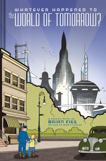
In the comic, Whatever Happened to the World of Tomorrow? by Brian Fies, both word and image are used on the book cover to create a quick glimpse of the narrative, while not giving away the whole story at once. It is important that image and word must coincide to create a message or theme that will attract the reader into picking up and reading the book.

Whatever Happened to the World of Tomorrow? contains two parts to the original book cover. The outside layer includes a paper flap which wraps around the hardcover book itself (picture on the left) and the main cover, without the cover flap (picture on the right). The picture on the left displays a world during the 1940s to 1960s era and the picture on the right portrays a more futuristic and space age time. The two images combine to make the official cover for the book. The cover works by putting the two images side-by-side, comparing and contrasting the two periods of time, which relates to the narrative of the comic. The title, Whatever Happened to the World of Tomorrow, at the top of the cover ties the two images together by asking a question to the readers. It makes the reader view the page as whole, making them think about the narrative and theme of this of this comic.

Credits: Fies, Brian. Whatever Happened to the World of Tomorrow?