Wacom is the world’s leading manufacturer of pen tablets, interactive pen displays, and digital interface solutions. One of their most popular products appealing to a wide variety of audiences is the Bamboo Pen Tablet.
The Bamboo Tablet's design focuses on the tablet's function as a tool of interaction with the user and the computer. The tablet is popular because of its versatility and capabilities, such as drawing, writing, note taking, editing images, and much more. It allows people to simply use the product without too many difficulties or complications.
Using a tablet is quite a different experience than using a mouse or track pad on a computer. When using a mouse of track pad for a prolonged amount of time, wrist pain is commonly experienced due to strain from a bent wrist. With a tablet, a pen enables the wrist to rest on the flat surface without bending, which eliminates the strain and allows a more comfortable experience. People tend to also be more familiar with the action of holding a pen or pencil so that it is natural as a pencil on paper. For many, using a tablet for the first time is not a problem.
Another benefit of the tablet’s design is that it enables much more free range of movement than a mouse or track pad. When using a mouse or track pad, motions are rash and quick, and it is often very difficult to make small detailed movements. Tablets excel in precision and detail because of their design. The human hand can easily grip around the pen comfortably allowing full control even in the slightest hand motion. Any shape, line, or curve, is easily achieved with the tablet pen. Many digital artists prefer to use tablets over any mouse or track pad because of its mobility and simply because it is easier to use.
The Bamboo Pen Tablet can connect to any computer, desktop or laptop, PC or Mac, as long as there is a USB port. Tablets can quickly execute actions with quick keys. They are usually located on the center of tablet pen and can be set to keyboard functions. There are also quick keys located on the edge of tablet surface. The addition of quick keys to the design allows the tablet to be customizable to the user, and can speed up productivity. Instead of using the cursor to scroll over and click the option, the user can simply press the quick key button to have the option selected, saving time.
The tablet is thin and flat so it is easily transportable. The dimensions are 9.8” x 6.9”, which is not too large, so it is easy to place on a desk and to store away. The Bamboo Tablet was designed specifically for the human hand's interaction with the computer screen. The tablet design succeeds in being efficient and task appropriate.
Credits: http://www.wacom.com/
Saturday, November 13, 2010
Sunday, November 7, 2010
Bamboo SK8 Decks
A few weeks ago, when browsing around at the town’s local skate shop, I had discovered something very interesting and new to the skateboarding world. My eye had caught a skateboard deck hanging off the rack, I asked the clerk to get a closer look. I could not believe it. The skate deck was made of bamboo!
You maybe thinking “Well, how do these decks perform?” After running the bamboo decks through some tests, they outperformed many maple tree skate decks. The bamboo material has the ability to absorb much of the impact when jumping and resists breakage, making it much stronger than many maple tree skate decks. The bamboo is also very elastic and has a natural rebound resulting in the best pops for tricks. The price range for these decks is also very inexpensive ranging from $20-$30, which is much more reasonable than regular skate decks going from $50-$60.
Bamboo SK8 takes much pride in their product. They are changing the world of skateboarding with their brand new sustainable bamboo skate deck design. I love the design and concept of using bamboo as a sustainable resource to create a message of environmental awareness, so I had to buy one for myself!
Credits: Bamboo SK8
Credits: Bamboo SK8
Word & Image - book covers
In my previous blog, I discussed Brian Fies’s comic Mom’s Cancer, explaining the relationship between word and image and how they are able to communicate a meaning or message much more effectively when used together rather than a using single image or text would. Not only are word and image successful in comic book storytelling, they are also used in marketing and advertising for book covers.
|
| Image: Brian Fies |
![]() |
| Image: Brian Fies |
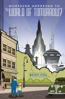
In the comic, Whatever Happened to the World of Tomorrow? by Brian Fies, both word and image are used on the book cover to create a quick glimpse of the narrative, while not giving away the whole story at once. It is important that image and word must coincide to create a message or theme that will attract the reader into picking up and reading the book.
Whatever Happened to the World of Tomorrow? contains two parts to the original book cover. The outside layer includes a paper flap which wraps around the hardcover book itself (picture on the left) and the main cover, without the cover flap (picture on the right). The picture on the left displays a world during the 1940s to 1960s era and the picture on the right portrays a more futuristic and space age time. The two images combine to make the official cover for the book. The cover works by putting the two images side-by-side, comparing and contrasting the two periods of time, which relates to the narrative of the comic. The title, Whatever Happened to the World of Tomorrow, at the top of the cover ties the two images together by asking a question to the readers. It makes the reader view the page as whole, making them think about the narrative and theme of this of this comic.
Credits: Fies, Brian. Whatever Happened to the World of Tomorrow?
Word & Image
“Comics books are a lot like rock music,” says Brian Fies, the author of Mom’s Cancer and What ever happened to the World of Tomorrow.
On Tuesday, November 2, Brian Fies guest lectured for the Intro to Design class at UC Davis. His first book, Mom’s Cancer, was influenced by his mother who was diagnosed with lung cancer. His inspiration came from sketching his mother one day during chemotherapy. Looking back at the sketch, he noticed how the combination of words and image worked together to describe what went on that day.
Comic books are essentially the juxtaposition of words and images. Brian Fies explained that comics transcend and the words and images must work together to tell a story. Without one or the other the message or meaning will be lost to the audience. During his lecture, he described comic books by using it an analogy to rock music. He explained that all rock music had lyrics and music. When the lyrics are separated from music, the message of the song is not as effective as having both music and lyrics together. Combining music and lyrics together give the song a much more powerful message and have a stronger impact on the audience. The same applies to comic books. The combination of image and words together give much more meaning and depth than having only words without images or just having images without words. Brian Fies chose the comic book form because juxtaposing word and image could easily establish metaphors, symbolism and imagery.
![]() |
| Image: Mom's Cancer by Brian Fies |
This is an image from Mom’s Cancer and also was used for the book cover. Brian Fies creates a bisecting border, splitting the image horizontally. The image implies a window panel. The viewer is looking into the window, into his mother’s life of as cancer patient. The upper half of the window marks the mind and the lower half the body. Mind and body are both represented in the text but are separated by the bisecting border in the center. The structure places viewers outside the window, looking in, distancing the audience from fully understanding the hardships and experiences. The combination of image and word exposes the exhaustion and pain of both mind and body.
Credits: Fies, Brian. Mom's Cancer.
Sunday, October 31, 2010
Trash Cleaning Trash
In the past, designers were only concerned with functionality and creating products with materials that best fit the need. But now realizing the impact of our existence on the environment makes us rethink of how we must change the way we life our lives. Our relationship with design has changed the way designers must design. Designers must now think and question where the design will end up in the future and how it will affect society. In our ever-changing society, the new constraint of design must not only be functional but also has to be sustainable.
A company called Electrolux AB is sparking a conversation about being more environmentally friendly, with their new design of vacuum cleaners. The vacuum cleaners are fully functional and can suck up dirt from carpet and rugs like any other vacuum, but these vacuums are special in they are made of plastic trash collected from the Indian Ocean and the Mediterranean, North and Baltic seas.
The design may seem very ironic at first, in that it is an object that cleans up dirt and garbage, and yet it is made out of something that was once garbage. People may question and wonder how something that was once considered garbage able to be something that is now so functional and useful. And then the conversation becomes about Design. Design is ephemeral. As the world changes, there will always be new problems to solve, new constraints to over come, and the role of the designer is to keep designing products that will help improve our lives and society.
Credit: http://www.mb.com.ph/articles
Industrial Design - mass production
In 1957, the Coca-cola company began using aluminum cans for its popular carbonated beverage. Now the aluminum cans are being used by many other companies and their beverages, such as Pepsi, Sunkist, Dr. Pepper, Hansen’s, and many others. Whether it’s a carbonated beverage or juice drink, the aluminum can design has been a popular way for people to enjoy their favorite beverage.
The reason why the aluminum cans gained popularity so quickly was because of its design. The cylindrical shape makes it very convenient for consumers to carry around and the cans could easily stack on top one another for easy storage. The aluminum material is durable enough to resist punctures and keep the beverage cool very nicely. The signature “click” when pulling the tab became a trademark in advertising the freshness and crispness when first opening the beverage. Not only is the aluminum can’s form functional, its exterior design became very marketable.
The Coca-cola cans are recognized by their signature red color. The vibrant red color catches our eye and we perceive the color with the emotion of excitement and joy. The white line that waves across the can suggests recreation and relaxation. It gives the viewer the sense that drinking a can of coke will help to relax the mood. The cans are also label with a specialized typeface, called Spencerian script. The logo is written in a cursive lettering style, which is unique in that it was a popular style of handwriting in the mid 19th century, relating to the Coca-cola Company’s history, being the classic original soft drink.
Through the form and content displayed on Coca-cola can’s design allowed it to be successful in marketing and effective in conveying its concept to the consumers. That is why the coke can had become very popular and the same can has been used for many other products and companies.
Form & Content: Objectified
“Every object tells a story if you know how to read it” a quote from Henry Ford, the founder of the Ford Motor Company.
The documentary film Objectified, by Gary Hustwit examines the role of everyday objects in our daily lives and the people who design them. When we first pick up an object we may not think about how much thought and work was put into that product that we use on a daily base. There is a reason why products are made the way they are, and it is not only for the aesthetic appearance.
Charles Eames from the film Design Q&A quotes, “Design is a method of action. Design depends on constraints.” The action of designing depends on constraints. The constraints come from the context of where the design will be, how it will be used, what will it be used for. The consumer’s interaction with the design will develop a relationship that will determine advantages and disadvantages that designers must work with.
Objectified discusses the role of a designer using the method of design thinking. With the constraints in mind, designers must question what form the design take, considering the visual aspect; the color, texture, composition, etc. The form of the design must also be related to the content, questioning whether or not design effectively communicates the message. It is important that the design must be functional and meet the required needs of the people. It must create an environment where people understand the design and feel comfortable with it. What is good design?
Design is everywhere and we use designed products everyday in our daily lives. Design is ever changing and improving and it is also changing the way we live our lives. Gary Hustwit’s Objectified documentary film, demonstrates the importance of our interaction and relationship with design in society.
Subscribe to:
Posts (Atom)